Website Design for Brandl Restaurant
Located in downtown Belmar, Brandl serves up fine innovative American cuisine. Chef/owner Chris Brandl, a Johnson and Wales graduate, approached Splendor in need of a web design
read more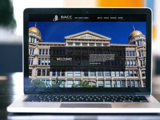
Splendor created a custom WordPress website for BACC Builders, one of New York’s premier commercial builders.
read moreLocated in downtown Belmar, Brandl serves up fine innovative American cuisine. Chef/owner Chris Brandl, a Johnson and Wales graduate, approached Splendor in need of a web design
read morePartnership for Maternal and Child Health of Northern New Jersey contacted Splendor to create a new brand identity for their organization.
read moreSplendor designed a custom website for Fiorentino Mechanical Contractors, a New Jersey HVAC company specializing in heating, air conditioning & energy efficient renovations.
read moreSplendor created a custom WordPress website design for Smart Center™, a company located in Seaside Heights, NJ, that offers building support for the community post Hurricane Sandy.
read more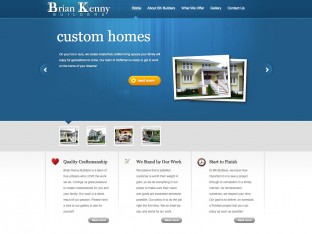
Splendor created a WordPress website for Brian Kenny Builders, one of the Jersey Shore’s premier residential contractors.
read moreSplendor created a unique WordPress website design for eduSTAR Tours, one of the foremost companies focusing on educational student tours.
read moreSplendor created a custom WordPress website for Ryan Scott, a magician/mentalist who performs at colleges, corporate events and private parties.
read moreThe Tuscan Bistro Bar is a gem among an endless string of generic chain restaurants. Located in Toms River, NJ, it’s perfect for quick lunches, family-style dinners, special occasions, or just a fun night out.
read more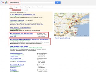
For months now we’ve been preaching the importance of SEO in combination with visually appealing website design. Finding that special balance between the two leads to improved search engine placement
read moreUnforgettable DJs has been a client of Splendor for over 10 years. We created a website design for them in 2005. The original web design won a prestigious GOLD W3 award, and really broke the mould.
read moreNicchio Ristorante in Belmar NJ claims “Italy Has a New Address!” They came to Splendor looking for an overall marketing plan to increase visibility and outreach for the restaurant.
read more
Florham Park Public Library came to Splendor looking for a unique and distinct logo design to rebrand the library. Their overall goal was to represent both traditional values and resources.
read more
Having a good looking website design is an important factor when trying connect with your target audience. Bland, boring websites, or cluttered, disorganized websites are not engaging.
read more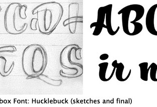
Typography is the art of arranging letters and words – a.k.a – “type” within a design or presentation.
read moreHere at Splendor Design Group we consider ourselves extremely lucky to be associated with so many wonderful local businesses, and Bubbakoo’s Burritos is one of our favorites.
read more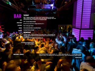
Known simply as “BAR”, this New Haven, CT hotspot needed a sleek, edgy new website to promote its active entertainment schedule, unique atmosphere, delicious pizza and on-premise brewery.
read more
It’s difficult being a small business owner trying to find new and inventive ways to grow and maintain your business. Keeping your business fresh and relevant is a delicate balancing act.
read moreSocial Networking isn’t just for “poking” old classmates anymore. Social Networking usefulness began to outweigh its sheer novelty right around the same time it became possible to find a job online.
read moreJoe Hurley HVAC is a Central New Jersey Heating and Cooling installation and repair service. Their focus is excellent customer service and quality installation and repair for affordable prices.
read moreMovie Portraits is a unique company that specializes in video portraits that create a unique and long lasting capture of a person.
read more
Our design team here at Splendor labors all year long in the pursuit of clear, effective and visually dazzling graphic design.
read moreDFI Pharma came to us with a very aggressive time frame for their new website project. This pharmaceutical company was exhibiting at a convention that was less than two weeks away.
read more
“Simplicity is the ultimate sophistication”, “Less is more”, “Keep it simple stupid!” – All important words to live by when it comes to building a business website.
read more
More text content is better, more pages is better. Google has said it – “Content is King” So it’s important to build a strong and ever-growing library of solid, informative text content.
read more
A good SEO Company can be an effective asset to the success of your organization. Search Engine Optimization is an important aspect of any business’ marketing efforts.
read more
If you’re a small business owner who lives on planet Earth and has even the smallest grasp on the reality of what it takes to grow your business then you know that having an online presence is crucial.
read more
This video is hysterical, but, sadly, not far from the truth.
read more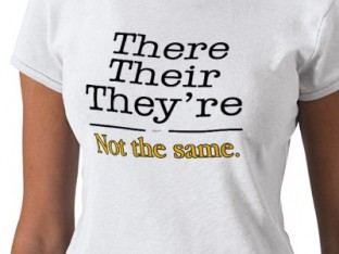
If reading the title of this blog was as painful for you to read as it was for me to write then you may just be a grammar snob.
read moreIdeal Trading Corp came to Splendor for an all new website design for their unique and niche business.
read more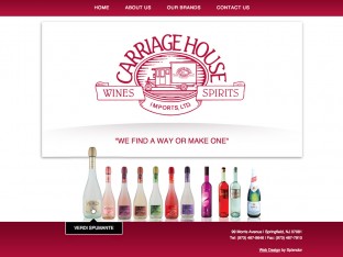
CHI Brands is a New Jersey based importer of specialty liquors. They recently commissioned Splendor Design Group to create a new website design for their company.
read more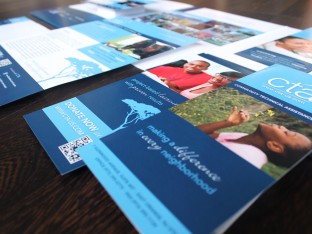
Community Technical Assistance, a NJ-based non profit, needed a marketing overhaul.
read moreDelMar Insurance hired Splendor to create a logo design for a new insurance provider. The client provided excellent feedback and guidance
read moreThe New Jersey chapter of the Surfrider Foundation has been a client of ours for many many years. Splendor strongly supports the group’s efforts to raise awareness about beach access, ocean pollution, and community
read moreGrowing Concern came to Splendor for a whole new marketing program, beginning with new logo design for their landscaping business, followed by new brochure design, stationery design, and website design.
read moreKPS Sons Carpentry is an Ocean County-based home improvement company. Splendor was approached to create an entire campaign for the company
read moreZTR commissioned us to create an all-new logo design for their NJ based provider of technical and IT services. This logo design project involved our standard process of research and Q&A to better understand the industry,
read moreCommunity Technical Assistance came to Splendor to redesign all of their marketing materials, including their previously basic website.
read moreVerdi Spumante is a massively popular brand name of sparkling beverage. Splendor was recently commissioned by Carriage House Imports to design an all new website for Verdi.
read more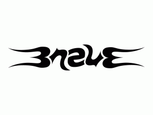
An ambigram is a piece of typography that may read the same – or completely differently – when perceived from another direction or rotation.
read moreWe recently designed and produced a marketing program for Electrum Inc. which included logo design, brochure design, pocket folder design, stationery design and website design.
read moreGreat, zesty new website design for Jakes Crab Shack in Belmar NJ. This straightforward website is casual and easy on the eyes. Menus and location info are easily accessible
read more
Typography is an all-important element in graphic design. From logo design to website design and everything in between, a well designed and properly executed piece of type can make all the difference in the success of the work.
read moreFor this Manasquan-based business, we designed and developed a handcrafted look and feel to showcase the amazing talents of these designers.
read moreThis all-new website launches Scoops Wine, the latest creation from Carriage House Imports. The blackboard and hand-drawn chalk design create a youthful ice cream parlor theme for the brand.
read more