Ideal Trading Website – Great Web Typography
Ideal Trading Corp came to Splendor for an all new website design for their unique and niche business.
read more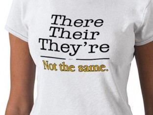
If reading the title of this blog was as painful for you to read as it was for me to write then you may just be a grammar snob.
read moreIdeal Trading Corp came to Splendor for an all new website design for their unique and niche business.
read more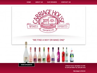
CHI Brands is a New Jersey based importer of specialty liquors. They recently commissioned Splendor Design Group to create a new website design for their company.
read more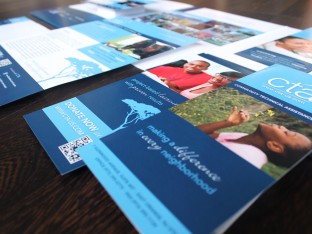
Community Technical Assistance, a NJ-based non profit, needed a marketing overhaul.
read moreDelMar Insurance hired Splendor to create a logo design for a new insurance provider. The client provided excellent feedback and guidance
read moreThe New Jersey chapter of the Surfrider Foundation has been a client of ours for many many years. Splendor strongly supports the group’s efforts to raise awareness about beach access, ocean pollution, and community
read moreGrowing Concern came to Splendor for a whole new marketing program, beginning with new logo design for their landscaping business, followed by new brochure design, stationery design, and website design.
read moreKPS Sons Carpentry is an Ocean County-based home improvement company. Splendor was approached to create an entire campaign for the company
read moreZTR commissioned us to create an all-new logo design for their NJ based provider of technical and IT services. This logo design project involved our standard process of research and Q&A to better understand the industry,
read moreCommunity Technical Assistance came to Splendor to redesign all of their marketing materials, including their previously basic website.
read moreVerdi Spumante is a massively popular brand name of sparkling beverage. Splendor was recently commissioned by Carriage House Imports to design an all new website for Verdi.
read more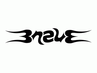
An ambigram is a piece of typography that may read the same – or completely differently – when perceived from another direction or rotation.
read moreWe recently designed and produced a marketing program for Electrum Inc. which included logo design, brochure design, pocket folder design, stationery design and website design.
read moreGreat, zesty new website design for Jakes Crab Shack in Belmar NJ. This straightforward website is casual and easy on the eyes. Menus and location info are easily accessible
read more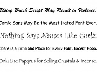
Typography is an all-important element in graphic design. From logo design to website design and everything in between, a well designed and properly executed piece of type can make all the difference in the success of the work.
read moreFor this Manasquan-based business, we designed and developed a handcrafted look and feel to showcase the amazing talents of these designers.
read moreThis all-new website launches Scoops Wine, the latest creation from Carriage House Imports. The blackboard and hand-drawn chalk design create a youthful ice cream parlor theme for the brand.
read more
Google has an established, simple score for websites and their pages. It’s called PageRank, and is a number between 0 and 10; ten being the best and zero the worst.
read more
In our new Splendor Says: Rules of Design series of posts, we’ll give a little insight into some of the guidelines that influence our design process.
read moreFor this technology solutions company, we went with a cool blue color scheme to match their technological approach. Utilizing drop-down menus and sharp photography
read more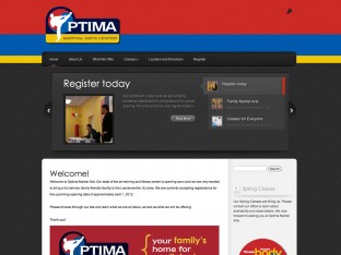
For this martial arts center, the website features extensive use of the company colors. With descriptive content and images from various events, the customer is included on all company happenings.
read more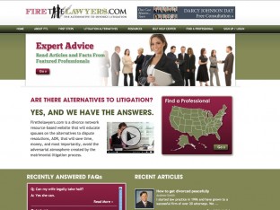
Using this website as a homebase to educate people about the process of going through a divorce, it both informs and connects those interested to the necessary resources.
read moreFor this landscaping company, we chose to highlight the beauty of their work. Photographs of lawns serviced by the company paired with images showing the tender care given
read more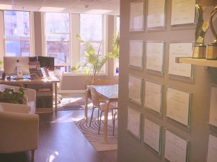
The new creative design studio is happy in the new studio space which offers lots of light, inspiration from the active and bustling town of Red Bank, and a gorgeous new office space.
read moreFor this law firm’s website, professionalism was a must. With a rich color palette, key imagery and detailed content, this website offers all necessary to the consumer.
read moreFor a company based around solar energy, we chose a color scheme that symbolizes the power of solar light. Bright yellows and oranges immediately grab the reader’s attention
read moreFor this website, we choose to go with a very bright and sunny look, highlighting the blue sky and green grass to make this community feel like home.
read more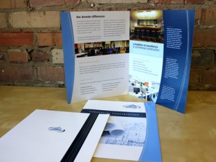
For this commercial construction and contracting firm, we went with a strong color palette and high-end photography to complete a print package designed to attract executives
read more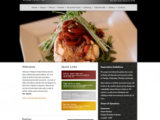
The website for this Belmar, NJ restaurant is built for the client. The user is able to update photo galleries and menus with an easy to manage data system.
read more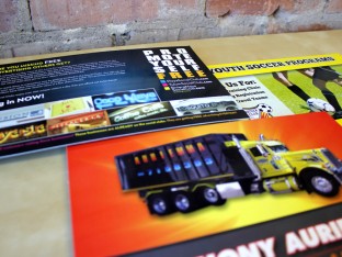
Oversized postcards are something that never go out of fashion. Bright colors, large text, and company information are all laid out in a unique way for each client.
read moreThis website was built for a recycling plant of lead, solder, and precious metals. With shades of green relating back to the eco-friendly cause
read moreFor this upscale Italian restaurant, we went with a classic color scheme with the colors of the restaurant highlighting the top. By integrating a slideshow into the homepage
read moreOur annual holiday card for 2010. This year’s sentiment was based around animal care. By showing our love for animals
read more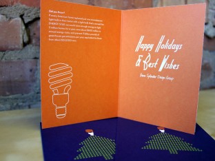
Our holiday card for 2011. In always wanting to spread knowledge with good sentiments, our message this year was about energy conservation.
read moreFor this home automation website, we made sure to give each service its own section. Complete with extensive galleries of work and informative content
read moreThis website was built to go right to the point. Bold, powerful colors combined with a very straight forward navigation system.
read moreFor our holiday gift in 2011, we chose to design these stainless steel bottles.
read moreFor this energy solutions company, we had to create stationery that was both unique and professional.
read more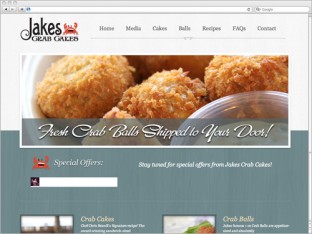
By incorporating commerce into this site, we were able to make Jake’s Crab Shack’s website come to life.
read moreFor this vodka company, we constructed a site complete with features.
read moreThis shirt design has become a signature for unity and pride amongst this activist group.
read more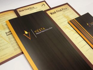
For this task, we had to create a sophisticated and upscale menu design for this Italian restaurant.
read more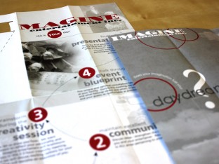
This unique brochure layout is filled with stylized typography and overlaying colors.
read moreA simple, fun logo for a company based around dogs and dog care.
read more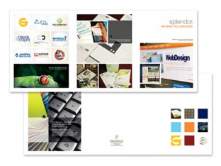
For our own business, we chose an oversized brochure, complete with extensive imagery and bold colors.
read more