Clearwater Village Website
For this website, we choose to go with a very bright and sunny look, highlighting the blue sky and green grass to make this community feel like home.
read moreFor a company based around solar energy, we chose a color scheme that symbolizes the power of solar light. Bright yellows and oranges immediately grab the reader’s attention
read moreFor this website, we choose to go with a very bright and sunny look, highlighting the blue sky and green grass to make this community feel like home.
read more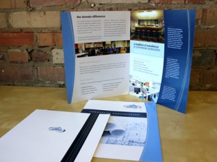
For this commercial construction and contracting firm, we went with a strong color palette and high-end photography to complete a print package designed to attract executives
read more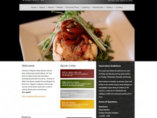
The website for this Belmar, NJ restaurant is built for the client. The user is able to update photo galleries and menus with an easy to manage data system.
read more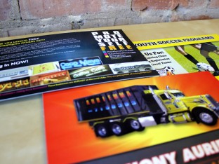
Oversized postcards are something that never go out of fashion. Bright colors, large text, and company information are all laid out in a unique way for each client.
read moreThis website was built for a recycling plant of lead, solder, and precious metals. With shades of green relating back to the eco-friendly cause
read moreFor this upscale Italian restaurant, we went with a classic color scheme with the colors of the restaurant highlighting the top. By integrating a slideshow into the homepage
read moreOur annual holiday card for 2010. This year’s sentiment was based around animal care. By showing our love for animals
read more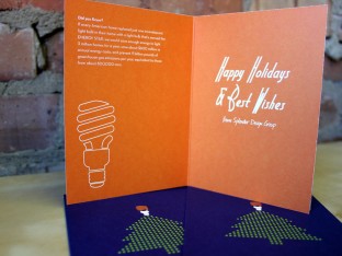
Our holiday card for 2011. In always wanting to spread knowledge with good sentiments, our message this year was about energy conservation.
read moreFor this home automation website, we made sure to give each service its own section. Complete with extensive galleries of work and informative content
read moreThis website was built to go right to the point. Bold, powerful colors combined with a very straight forward navigation system.
read moreFor our holiday gift in 2011, we chose to design these stainless steel bottles.
read moreFor this energy solutions company, we had to create stationery that was both unique and professional.
read more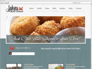
By incorporating commerce into this site, we were able to make Jake’s Crab Shack’s website come to life.
read moreFor this vodka company, we constructed a site complete with features.
read moreThis shirt design has become a signature for unity and pride amongst this activist group.
read more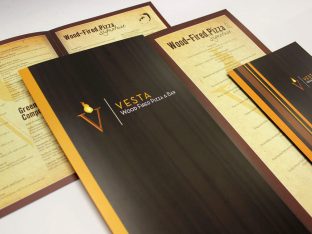
For this task, we had to create a sophisticated and upscale menu design for this Italian restaurant.
read more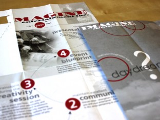
This unique brochure layout is filled with stylized typography and overlaying colors.
read moreA simple, fun logo for a company based around dogs and dog care.
read more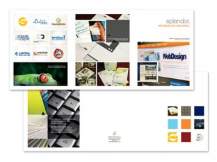
For our own business, we chose an oversized brochure, complete with extensive imagery and bold colors.
read more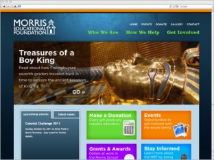
With fun imagery, bold typeface, and bold colors, the website is a complete package for any organization.
read moreThis site is a great combination of professionalism and simplicity.
read more
This package of print material focuses on the company’s mission and the eco-friendly benefits of using their company.
read more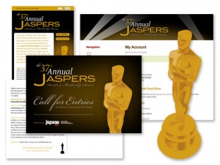
This design scheme was meant to be spread across all marketing materials and to unify all aspects of the awards.
read moreFor this business, we designed bumper stickers, stationery, and flyers in a complete print package to cover all sides.
read moreThis logo design mirrors the company’s mission. Using a minimalist design, it aims to take up as little space as possible, much the same as the mess a landscaper aims to make.
read more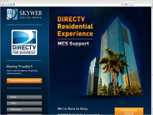
This website takes full advantage of the offerings of WordPress. On the front end, it contains all of the professionalism of DIRECTV, complete with images and brand standards.
read moreThis site works on two levels. It is very visually grabbing, by utilizing (literally) extreme green in the layout. It also features extensive SEO work that make it a top hit on search engines.
read more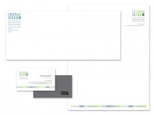
This stationery set was designed to attract high-end wedding industry clientele.
read moreThis menu design features a take on both a “Margaritaville” and Jersey Shore theme.
read moreThis website was built for an eco-conscious NJ business.
read moreWith this logo design for Brandl. Restaurant, our task was to reinvigorate an already established restaurant.
read moreFor this local Mexi-Cali restaurant, it was important to keep the grittiness of the Jersey Shore.
read moreTo meet the client’s request to have full control over the site, Clean Flow’s website was built to allow the user to not only update pictures and blog entries, but to change content as he liked
read moreThe website for Straffi and Straffi Attorneys is one that communicates both professionalism and trust.
read more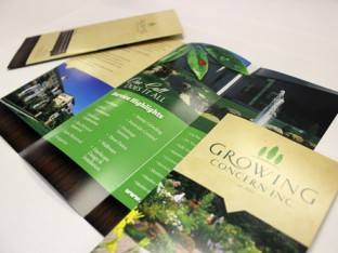
This brochure design for Growing Concern Inc. is one of the easiest to share print pieces.
read moreThis new website design for Hudson Perinatal Consortium features a visually appealing color palette in addition to a slideshow of testimonials and photos.
read more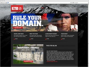
This website was created for a fitness company who focus on fitness supplements and training tips and trips.
read moreThis logo design for CSD is a high-end logo design for an accredited spinal surgeon.
read more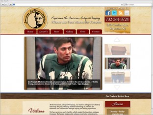
The newly designed website for American Antiques Company features a look and style that matches the company’s mantra – “Where the Past Meets the Present.”
read more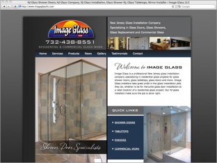
The new website for Image Glass, LLC is a well designed, extremely SEO-friendly site with extensive keyword placement and highly crafted copy.
read more
Deciding where to focus your energies and resources is a challenge, especially when it comes to marketing your business.
read more
In business and in life in general, you can’t be in two places at once, and it seems everyone is fighting the clock.
read more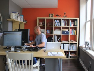
Have you seen pictures of our new studio yet? Located at 50 Broad St. in Red Bank, NJ, this is our wonderful home!
read more
Marketing evolves faster and faster every year; no one can predict what the next big thing will be.
read more