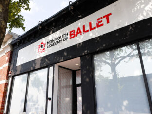
Monmouth Academy of Ballet Unveils Its New Home
Explore Monmouth Academy of Ballet’s 10-year growth and new Broad Street studio. Learn how Splendor’s marketing has driven success for this top Red Bank, NJ ballet school.
read moreTypography dates back to the earliest hieroglyphs, which eventually developed into the alphabet. By the Middle Ages, people began to hand-write and illustrate manuscripts with beautiful letters that were a work of art in themselves.
Today, typography features many different styles, each with a specific tone and purpose. It defines the overall mood of a logo or advertisement.
Typography impacts your business and your overall brand in a number of different ways, including whether you look professional or not.
Your logo is extremely important. It takes about 10 seconds for the average person to develop an impression of your logo. You can see why using the same type for your logo is crucial. If you begin to change things, the consumer isn’t as likely to recognize your brand.

MailChimp’s logo is reflective of their overall fun and informal tone. The cursive, handwritten-looking type is inviting.
It’s also simple enough that it easily adapts to any color background — as shown on their page featuring their logos and offering the option to let you place the logo on different background choices.
If you run a brick-and-mortar store, the signage you use can make or break your foot traffic. You want a sign that pops but that also reflects your logo and overall brand personality.
If you sell clothing for Generation Z, you’ll want to use bright colors and an informal font. On the other hand, if you sell life insurance, you’ll need more serious colors and a formal font to ensure your customers see you as trustworthy.
The type you use on your website should reflect your overall brand’s tone and work well with your logo.
This is where font families come into play. You can often choose one or two specific fonts to utilize on your website and create a design where everything matches and meshes well together.

Wing Tactical uses strong, masculine-looking type on their page. The size differs, but the font remains similar, especially for the headings and major points on the page. Note how the font in the logo also has a similar bold, straight-edged and strong look to it.
Any piece of paper you send out should be obvious that it’s coming from your brand. Use your logo on your letterhead, but go even deeper and choose a font that complements what’s used in your logo design.
You want the letter to look professional and make an impact on the person reading it.
Your brand’s presence on social media should match your presence in your brick-and-mortar store and on your website. Using a similar font or even the same one as you use in these places allows you to create a consistent image for consumers.
Not only should you use your logo and similar typography in your profile images and cover images on social media sites, but you should also use it when creating memes or ads to display on these sites. Even the colors you use should be similar.

Dr. Pepper does an excellent job on their Facebook page of using the same type they use in other advertising and for their brand overall. When you see their cover image, you immediately recognize it as their logo.
Online newsletters are an ideal way to reach out to your customer base and stay in touch.
However, if your newsletter doesn’t reflect the overall look of your brand, it might fall flat or confuse consumers.
Use the same typography you use on your website, so users immediately recognize that the newsletter is from your brand. You should also use a similar color scheme for any visual elements on the page.
Don’t let an advertiser talk you into a fancy ad design that completely goes out to left field from your overall brand image.
Instead, keep with the same general idea as all your other advertising and use the same logos, typography and tone of voice.
Whether the consumer sees an ad on a social media site or visits your website directly, they should recognize you at a glance.

This ad for Evian, created by Edvin Puzinkevich is beautifully artistic but still recognizable — because of the typography and the logo that is the same as on an actual bottle of Evian water.
However, the ad is striking because it uses the elements around the bottle to create a cohesive and stunning impact.
The packaging and bags you put your products and merchandise in serves as another way to advertise your business and increase brand recognition.
As with other forms of communication, you’ll want to use the same type, colors and overall tone to convey who you are as a business.
It’s important to use consistent typography across all the different platforms your brand has a presence.
Ninety percent of people expect that their experience will remain consistent no matter how or where they interact with your brand.
Every single thing you put out should run through the filter of whether or not it matches your overall branding and messaging.
Typography that is difficult to read or doesn’t make sense for your mission as a company should be avoided.
The type you choose matters, so take the time to pick something you’ll want to use long-term and that reflects your brand’s personality.
Paying attention to this small detail can mean the difference between being recognized and not.

Lexie Lu is a contributing writer for Splendor Design and a freelance designer. She enjoys writing code and learning about new web platforms. She manages Design Roast and can be followed on Twitter @lexieludesigner.

Explore Monmouth Academy of Ballet’s 10-year growth and new Broad Street studio. Learn how Splendor’s marketing has driven success for this top Red Bank, NJ ballet school.
read more
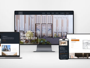
Check out how Splendor was able to create a new website, new logo, and new brand position to tell the modernized, transformative story of 101 Hudson as the premier destination for businesses in Jersey City.
read more
So much talk today is centered around the implications of technology, specifically AI, in our modern age. Where will AI take us? How will it change marketing? Our lives? The world?
read more