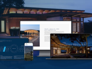
Trends in web design these days are hard to get away from, new interesting layout approaches and cutting edge functionality are constantly arising and gearing the web design approach. What it really comes down to is that good design matters and knowing the rules before you break them will ensure the success of the design of your website.
Clean design focuses on the precise positioning of importance of the elements throughout the layout.
Every detail and graphic has its place – a place for everything and everything in its place. Cleanliness in design comes in many forms: crisp typography, uncluttered layout, unified color choices, strong imagery, visual hierarchy, and the careful use of white/open space.
A website can be considered quite busy with lots of elements to consider, but as long as the design is kept clean, the website will work. Clean website design conveys elegance. Some companies that example this approach successfully are Apple, Rackspace and PayPal. This billboard style approach draws attention to the messaging and makes browsing easy for the user experience. In contrast; cluttered and mundane websites can distract and loose customers before you’ve even had the chance to tell them what you’re all about.

Below are some key factors we take into consideration when designing a clean and crisp website.
White space and breathing room around elements in the layout
The extra space between any two elements (breathing room) in a layout keeps the items from pushing against one another. This is hands down the most frequent mistake among junior designers – not leaving enough breathing room around design elements. Proper breathing room doesn’t mean that everything needs lots of space, but everything on the page needs “enough” space around it. In most cases this means that all your design elements should have gutters of space surrounding text, and most other graphic elements.
Giving each page a clear focus
Whether it’s a picture, a headline or graphic – this gives the user an immediate clue as to what the page is about.
Choosing a well proportioned and properly weighted typeface
This will establish the hierarchy needed for the layout to feel clean as it helps the reader flow through the information.
Using crisp clean lines
Drop shadows can really destroy the clean design approach. This is not to say that a little shadow here and there isn’t a good thing – it can be – but overly done it now starts to take the site back to that old standard virtual look and feel. Drop shadows and gradients can be used sparingly and can offer some nice depth and create a personal style for the design. They should be used consistently throughout.
Color and complementary colors
Most of the time, the best clean designs use one major color and 1 or 2 complimentary colors. Working with one major color and varying the tone of the color to come up with every other color you need for the design creates an elegant website. Introducing one or maybe two other colors into the design will draw attention to the calls of action or elements that have importance.
Give the user a clear sense of importance hierarchy
The most important elements on any page design should be larger and more prominently placed on the page.

There is a real art to effective clean website designs that not all designers can effectively master.
When you limit the number of graphic elements you use and put the focus on negative space and typography, a good eye for spacing and proportion becomes crucial. Every element on the page has a reason for being there and is systematically placed.
I hope this helps bring awareness to the importance of working with a professional experienced web designer on the layout and why clean web designs are powerful and elegant at the same time.


