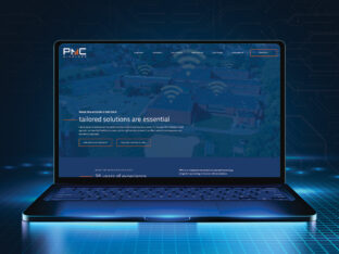
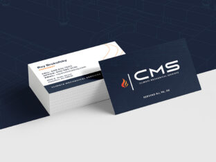
A brand logo defines every conception you have about your brand and even the way others see your brand.
Logos are used on websites, printed material, social media and even on product packaging and the exterior of your place of business. They are one of the most vital parts of what characterizes your company.
Around 77 percent of marketers indicate branding is one of the most critical aspects of creating stronger brand recognition. Since the logo is often the most recognizable part of your branding efforts, it’s also essential your logo clearly defines your brand while also standing out from the logos of competitors. If you’ve been in business for a while, it may be time for a logo refresh.
Here are 15 signs indicating your logo needs attention
1. The Colors Don’t Match Your Brand Palette
As businesses mature, they discover some colors have a more significant emotional impact on their target audience than others.
Colors create a psychological reaction in those who view them. Blue might signal trust and red might signal excitement, for example. What if you designed your logo before you developed your color palette?
It might be time to make sure the two elements of your branding complement one another.
2. A Competitor Copied You
If your business is successful, people will copy what you do. Unfortunately, a competitor may have come out with a logo so close to yours that the two are almost indistinguishable.
As a small business owner, you might not have a lot of funds to launch a trademark dispute. However, you can revamp your logo, so it stands out and differentiates you from your competitors.
3. You Haven’t Kept up With New Tech
Technology advances at a rapid rate. Whether you’re involved in the tech industry or you want to show you’re up with the latest devices, upgrading your logo to show the most recent trends gives your brand a current look.
One example lies in the mobile computer industry, where smartphone ownership increased 35 percent since 2011.
4. You’ve Let the Logo Get Outdated
You’ve probably noticed that big brands such as Pizza Hut and Microsoft change their logos ever so slightly from time to time. As design trends change and screen resolutions become higher definition, your logo design needs to adapt.
Changes aren’t always big rebrands, but sometimes small elements such as adding gradient color or removing a shadow.
5. Your Customers Are Bored
Is your logo boring to your customers? Although you can only get so creative with a logo, designers have more tools at their disposal today for adding unique typography and creatively using white space.
If your logo is a little blah, add some exciting elements. Your customers should feel excited when they see it.
6. The Drawing Looks Amateurish
When businesses first start, the founders often do everything themselves to save a few bucks. Maybe you drew the logo or went with a cookie cutter design from a discount site.
While the logo may generally send the message you’d like to send to users, it also could likely say the same thing in a better way. Invest in a professional redesign.
7. The Message Is Irrelevant
What does your brand stand for and is that reflected in your logo in some way?
Sometimes you may not have realized the exact purpose of your business when you started but developed a mission along the way.
One example of a logo that matches the brand message would be FedEx. They are into fast logistics, and their logo looks as though the letters are in motion.
8. Your Audience Changed
When you first started your company, you may have had a specific audience in mind. However, over time, the focus of your branding shifted, and your audience is entirely different.
Figure out if your logo still matches your target audience. For example, if your new audience is Generation Z and you originally designed your logo for Generation X, then it may be time to tweak the colors and make the design trendier.
9. The Logo Is Too Complex
Another mistake new brands often make is throwing everything into the logo to make sure people understand their brand at a glance. Unfortunately, throwing everything onto a logo also creates a lot of confusion for the user.
With a busy logo, the user may not know where to look. The message gets watered down, and the user gets confused.
If your logo has too many elements, whittle it down to just one key item that best defines what you go through the user’s eyes. Think about logos such as Whole Foods. They use a green shade to show nature and health, their name and a single leaf above the letter “O” to signal fresh produce.
10. Your Business Expanded
Perhaps you focused on one small aspect of your business in the beginning, and the logo reflects that portion. However, your business grew and expanded into other areas. Now, that singular focus on one aspect of your business isn’t enough to define what you do as a brand.
Think about how you can keep elements of your current logo but rebrand, so it shows the scope of what you currently offer. The changes could be as simple as removing an icon from the logo design or as complex as changing the name.
11. Customers Don’t Connect With the Logo
What if your customers don’t connect with your current logo? Perhaps you completed some field tests, and the results showed users don’t even know what your logo looks like.
If your target audience doesn’t connect with the logo, it may be time for a refresh. Work with a designer and come up with a logo that represents your brand and connects with your users on an emotional level.
12. You Rebranded Other Aspects of Your Business
Every element of your brand ties together as a whole and leaves an impression on consumers.
If you rebranded your name, your website colors or your social media presence, you must also redesign your logo, so it matches the new branding efforts. Probably the easiest way to rebrand your logo so it matches your other marketing efforts is by allowing the same designer to do all the work at once.
13. You Moved to a New Location
Often, your brand logo includes the location such as a coffee store with the city listed somewhere in the logo design. If you’ve moved locations or expanded into new territories, it’s time for a logo redo.
If you plan on expanding into other areas in the future, you may want to leave location out of it altogether or at least allow for a design that lets you customize each logo for a particular store.
14. The Company’s Core Values Changed
Maybe your company recently got behind a social cause, and your entire values shifted. You’ve gone green or embraced other social issues. Consider whether your old logo shows this shift in your company’s core values or if it matters that you show this through your logo.
To communicate the causes you stand behind, you’ll need to weave the information into your logo design. Expressing your values might mean changing the logo colors, adding a tree with leaves or some other elements which indicate your social platform.
15. The Logo Doesn’t Adapt Well
If your company logo was created to go on your storefront sign and today you sell more online than anywhere else, it may not size well to social media and other places. Images today work best when they’re optimized, so the size adjusts for mobile devices as well.
The text must still be readable in smaller sizes, so view your logo in different pixels and from different distances. If it’s hard to read or comprehend, it’s time for a redesign.
Invest Your Time and Budget Wisely
When it comes to what you spend your time and money on in your business, a logo refresh is one of those things that brings a lot of value.
Your logo represents you almost anywhere your brand has a presence, so it is arguably one of the most important elements of your business. A refresh doesn’t have to be extensive to be effective. Work on what fits in your overall marketing budget and make little changes here and there, so your logo stays current and on message.
Our team is here to help – with years of experience and artistic expertise, we’ll transform your logo into a powerful mark that communicates your story to your customers.
get started!


