tipping point insurance

Tipping Point is an insurance company specializing in risk management services for small and middle market businesses. As a new company, they needed a strong image to stand out from competitors and convey their expertise. Splendor provided comprehensive branding services, establishing Tipping Point’s look, feel and messaging.

The startup’s name, Tipping Point, represents the point at which starting a business transitions from uphill climb to monetary success. The logo exudes strength, without being overly masculine, incorporating purple and gold to symbolize courage and success.

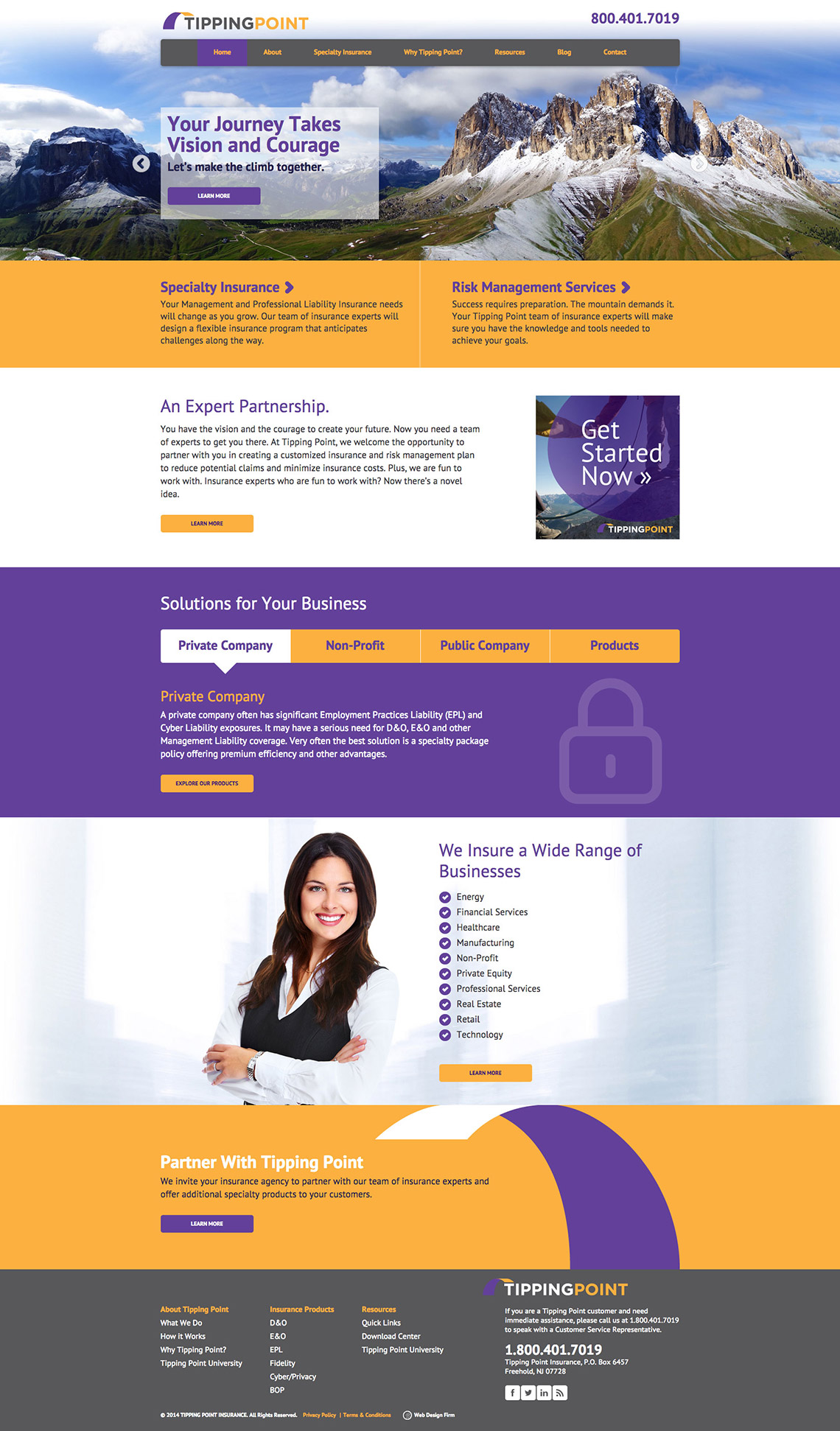
Clean blocks of color and flat design elements give this site a sophisticated look. We incorporated mountain imagery relevant to Tipping Point’s theme of a journey or climb to convey the courage and strength it takes to grow a sustainable business.

Custom icons on the homepage help guide the user towards information specific to their type of business, including private company, public company and non-profit. The site is responsive, and easy to update through the WordPress backend, with the option to add blog articles, downloads and other resources.

In addition, Splendor provided copy editing and optimized the site for maximum search engine visibility. This website won a silver Communicator and American Web Design award in 2015.

Custom web design for a well-rounded user experience.

awd

GDUSA Award Winning Website & Brochure Design, Communicator Award Winning Website Design, American Web Design Award Winner