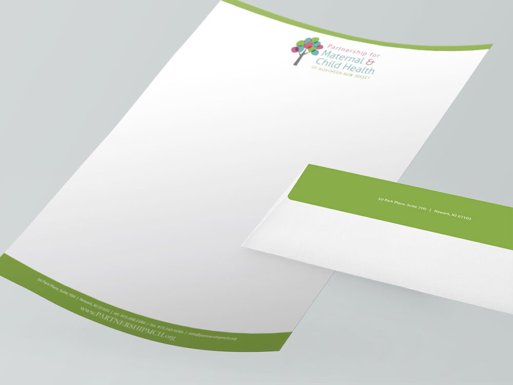
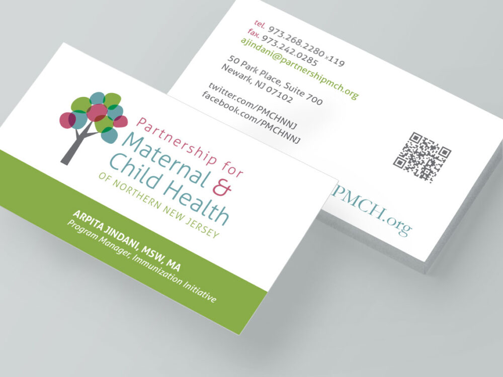
Splendor crafted a unique visual identity for PMCH, highlighting the organization’s commitment to serving mothers and their children across Northern New Jersey. The logo was a representation of the ten various health organizations that came together under one new parent consortium. the branches and leaf sections of the tree were comprised of different colors, that also created additional hues where their sections overlapped.

Branding and Logo Design
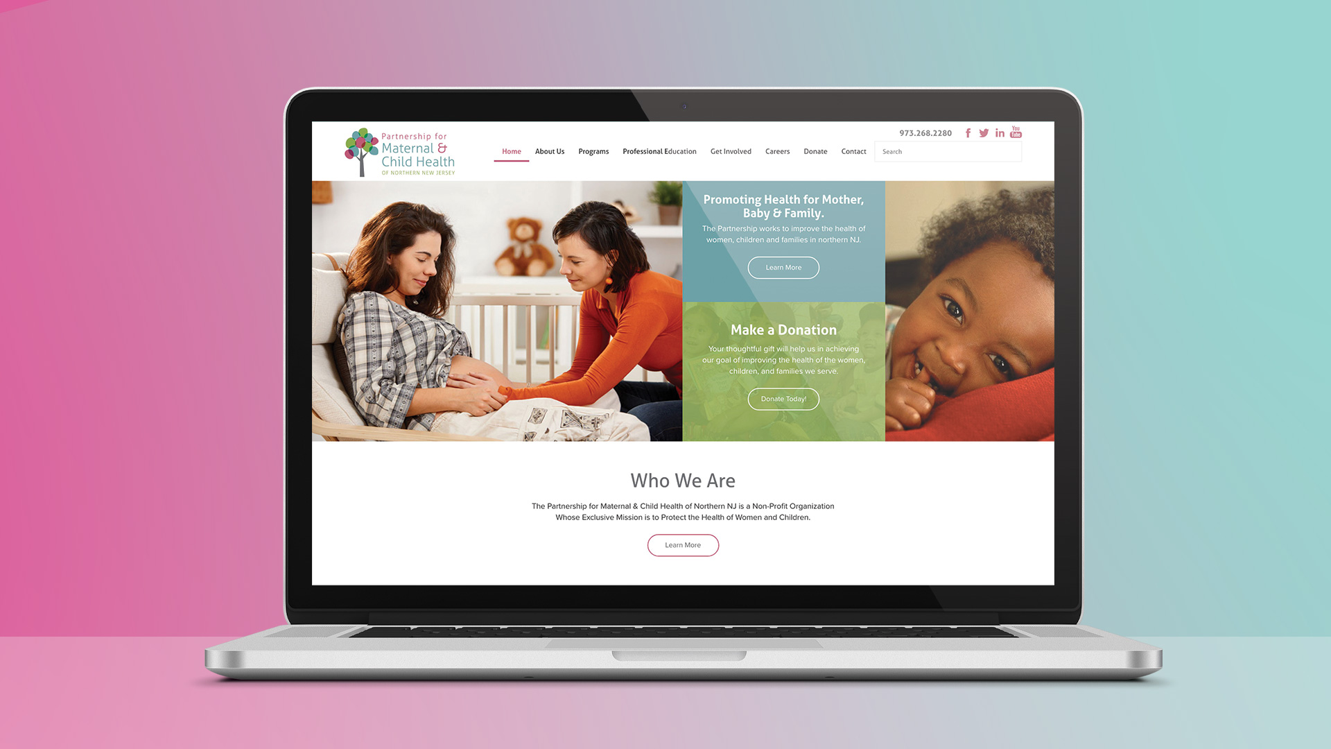
We developed a custom website that highlights their news, educational programs, events, and programs. Our custom WordPress development approach created an intuitive environment for non-technical staff to manage the website. The website we created provides an easy-to-manage set of tools for the Partnership’s events and programs.
Custom Website Design

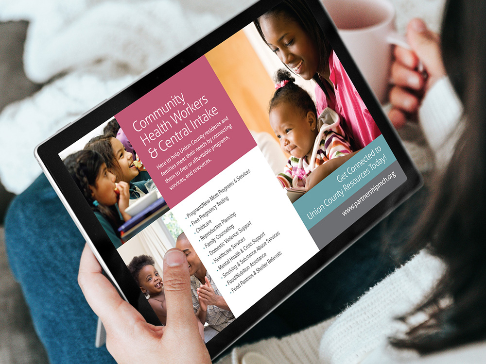
Splendor created a suite of print material to promote the specific programs within the Partnership. From tri-fold brochures to postcards, all of the print designs complement the colorful branding we created for the organization. Several of the programs within the Partnership have been successful enough that they warranted their own logo designs to promote their activities and efforts. Splendor also designed additional logos that utilize the typeface and color schemes established in the primary brand.
Collateral