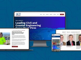
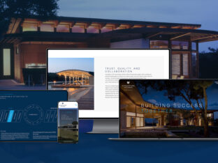
Whether you’re having a new website built for your business or giving the current one a makeover, there are a ton of popular design features to consider. Some features are strictly for aesthetics, others play a more important role in functionality and, equally important, the user experience. Every design trend has a life cycle. Very few styles last forever, whether we’re talking fashion, décor, or graphic / web design. Certain design features that were popular as recently as a year ago may already look dated. Even worse, in the world of website design, outdated styles may actually render parts of your website dysfunctional.
So if you’re ready to freshen things up a bit, here are a few of Splendor’s recommended design features. Keep in mind, anything too brand-new may be a short-lived flash in the pan. On top of that, if new technology is involved, there may be some bugs to work out before the functionality is deemed stable or reliable.
Lightbox
The lightbox effect is a modal window that appears on top of the screen you are presently viewing, after a link or thumbnail image is clicked. Lightboxes have been around for about 10 years, but are still very elegant and practical tools. They are often used for alert messages – such as “Do you really want to Log Out?” The lightbox is also effective for businesses that want an elegant and easy to use portfolio or gallery section within their website. This feature allows images to be featured in a larger scale without navigating away from the current page or blocking out the background completely. This allows the user to remain within the gallery or portfolio and simply close out of the image to keep viewing other projects.
Example: Click here to see a lightbox example!
Parallax Pages
A relatively recent design trend, parallax effects are the result of foreground content scrolling up a page faster than background content. The effect can be visually stunning, incorporating animated graphics, full screen background images, and elegant type elements. The key to success in the parallax realm is to make sure your content and surrounding environment complement each other, rather than compete.
Example: http://poppyspend.britishlegion.org.uk/
Video Backgrounds
Using HTML5, video backgrounds are typically full-width areas of a page that display a short, looping video clip in the background with primary content over top. The end result is a full motion movie of sorts, which can be extremely eye-catching. As with parallax designs and ALL background design in general – the result can be a very busy layout which could potentially detract from the page’s message. Video backgrounds are a very hot design trend right now, but should be used with caution.
Example: http://www.dromoland.ie
Lazy Loading
This terms refers to displaying content (images) only when they are called into the page of a website. From a performance standpoint, this can greatly increase website speed. For example, a page with 50 large images may take a very long time to load completely. Conversely, a page that only loads images as the viewer scrolls to that point on the page where the image is displayed will load quickly and create a more positive user experience. An additional benefit to lazy loading is the ability to have images appear gradually as the content is loaded. This gives the impression of flowing content as the page scrolls up.
Example: www.friendlys.com
These four features only begin to scratch the surface of the website design trend arena. New features, tools, and layout styles are being developed every day and it’s up to experienced website design teams like Splendor Design Group to help shape the way they are utilized.
For information on services offered by Splendor Design Group like website design, logo design, print design, brochure design, and media relations, please visit our website here. Or to view completed works, please visit our portfolio!


