Brand Consistency Across All Channels
A consistent brand is a stronger brand. Discover how to align your voice, visuals, and messaging across every touchpoint.
read more![]()
Tipping Point is an insurance company specializing in risk management services for small and middle market businesses. They approached Splendor in need of a brand image for their company.
We designed a logo that conveys the tipping point concept–the point at which the uphill climb of starting a business gives way to monetary success. Tipping Point wanted to convey a message of admiration for the courage and strength it takes to grow a sustainable business.
The resulting logo exudes strength, but without screaming out with excess testosterone, incorporating purple and gold to symbolize courage and success.
A consistent brand is a stronger brand. Discover how to align your voice, visuals, and messaging across every touchpoint.
read more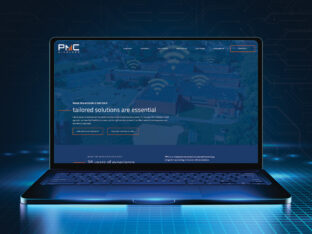
PMC Wireless partnered with Splendor to refresh their brand identity and digital presence. A new logo, refined messaging, and custom website now reflect their leadership in mission-critical communications.
read more
Your logo is more than a mark. It’s a business signal. Explore the signs it’s time for a redesign and how strategic brand identity design strengthens positioning, credibility, and growth.
read more