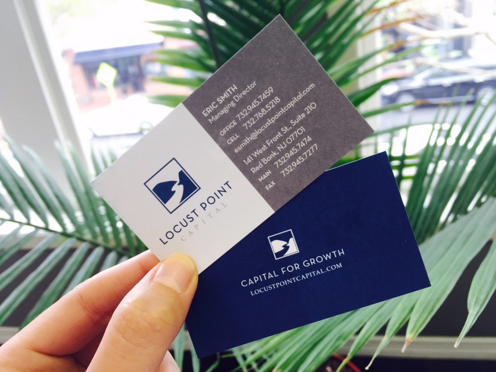
Splendor recently completed logo and business card design for Locust Point Capital, a specialty finance company in Red Bank. Inspired by their location along the Navesink River, we created an iconic, yet fairly conservative logo that communicates elegance and sophistication.
Although young, Locust Point has a strong background and solid history within the firm’s leadership. This new branding helps convey longevity, knowledge and experience.
Stay tuned for their new website, which is currently in the works!
Splendor Design Group believes an educated client is our best client. Stay tuned to our blog for insight in the world of everything design, web, and digital media. Have something to add? Connect with us on social media – we’d love to hear from you (links below).
Signal Strong, Brand Stronger: PMC Wireless Reimagined
PMC Wireless partnered with Splendor to refresh their brand identity and digital presence. A new logo, refined messaging, and custom website now reflect their leadership in mission-critical communications.
Why Businesses Are Turning to Full-Service Branding Agencies for Competitive Advantage
In competitive markets, a logo or website alone won’t cut it. Businesses are turning to full-service branding agencies to align strategy, messaging, and design, creating clarity that drives growth.