
February 21, 2013

Logo Design for Florham Park Library

Florham Park

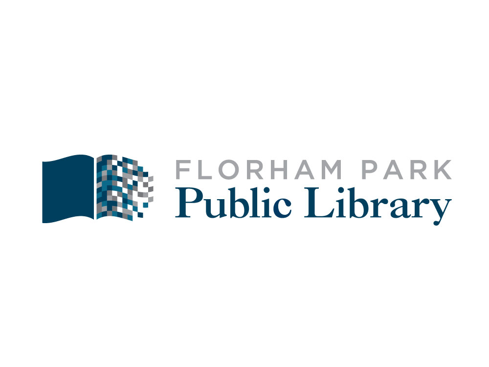
Florham Park Public Library came to Splendor looking for a unique and distinct logo design to rebrand the library. Their overall goal was to represent both traditional values and resources, such as references and books, as well as their dedication to newer resources and technologies. “We want to preserve our heritage and open the door to the future.” The new logo design that Splendor created is a blend of old and new. With a clever, expressive icon and clean and elegant typography, the new logo design solidifies the library’s image and establishes a foundation upon which all future outreach efforts can be based.

The color scheme of the brand compliments the interior space of the library, and this will also be carried through into stationery, print collateral, and an all-new, easy-to-manage website design, which is being built on the WordPress content management system. FPPL has gotten overwhelmingly positive feedback on the design so far, and we are all excited to carry the momentum through to additional design projects.

you may also like...

Forbes Agency Council Article: Polish Without Strategy: The Real Risk Of AI Creative

Adam Taylor CEO of Splendor explores why AI-generated creative needs strategic thinking, explaining why polish alone cannot replace human judgment and brand insight.

read more


M Station in NY Times

When Strategy Shapes a District: M Station and the Power of Designing Beyond the Building

M Station in Morristown, New Jersey was recently featured in The New York Times.

read more
MSW Legal Case Study

Brand Consistency Across All Channels

A consistent brand is a stronger brand. Discover how to align your voice, visuals, and messaging across every touchpoint.

read more