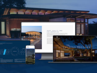
Everyone has heard the old adage, “Less is more.” In the world of design, this phrase speaks to the importance of negative space, a principle that is essential for website and print design projects – or any layout or page composition initiative. Negative space, also known as white space, refers to the area surrounding design elements or the empty space between them. It may seem counterintuitive to dwell on the empty spaces, but it is precisely this space that plays a crucial role in making a design look polished and sophisticated.
Splendor is an award-winning creative agency with decades of experience in design and layout. Our team of designers and developers understands the importance of negative space in design and how it can impact the success of a project.
So why is negative space so important? There are several reasons, including:
- Improving readability: Negative space can help make content easier to read and digest. When there is too much clutter on a page or website, it can be overwhelming for the reader. By incorporating negative space, you can create a visual break that allows the eye to rest and the reader to absorb the information more easily.
- Creating balance: Negative space can help create balance in a design. It can help distribute the visual weight of design elements, ensuring that the overall design feels cohesive and balanced. This is particularly important in print design, where the balance of text and images can make or break a design.
- Drawing attention: Negative space can be used to draw attention to specific elements in a design. By creating a “breathing space” around key design elements, you can make them stand out and draw the viewer’s eye to them.
- Enhancing aesthetics: Negative space can enhance the overall aesthetics of a design. It can make a design look clean, sophisticated, and modern. It can also help highlight the beauty of design elements and make them appear more visually appealing.
At Splendor, we understand the importance of negative space in design, and we incorporate it into our projects in various ways. For example, in website design, we use negative space to create visual hierarchy, separate different sections of a page, and draw attention to important calls to action. In print design, we use negative space to balance text and images, create a sense of flow, and enhance the overall aesthetics of the design.
White space or negative space is an essential principle in design, and it is crucial for creating successful website and print design projects. If you are a client, unless you have formal training in layout, design and page composition, it might be a good idea to listen to your design professional. The recommendations they make are based on years of training and experience, all of which culminate in the specialized skill of knowing when to say when, and when knowing that less is more.
If you’re looking for a creative agency that has the training, education, and experience in all aspects of creative work, Splendor is your team.


