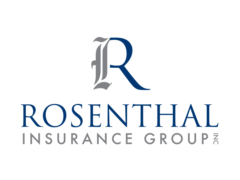
Rosenthal Insurance Group, one of the leading father and son insurance companies in NJ was seeking a logo that perfectly represents their firm with two distinct, yet complementary approaches to business.
Splendor’s design team created a clean and professional logo that marries the concepts of tradition and integrity with a progressive, contemporary approach. The primary element of this logo design is the elegant, custom letterform logo of the company name. The “R” is composed of two distinct parts, one of which is an old calligraphic letter shape, and one of which is a modern serif typeface. This logo has been used in a complete stationery system as well as website design.
Splendor Design Group believes an educated client is our best client. Stay tuned to our blog for insight in the world of everything design, web, and digital media. Have something to add? Connect with us on social media – we’d love to hear from you (links below).
Signal Strong, Brand Stronger: PMC Wireless Reimagined
PMC Wireless partnered with Splendor to refresh their brand identity and digital presence. A new logo, refined messaging, and custom website now reflect their leadership in mission-critical communications.
How to Know It’s Time for a Logo Redesign (And What to Do Next)
Your logo is more than a mark. It’s a business signal. Explore the signs it’s time for a redesign and how strategic brand identity design strengthens positioning, credibility, and growth.
Why Businesses Are Turning to Full-Service Branding Agencies for Competitive Advantage
In competitive markets, a logo or website alone won’t cut it. Businesses are turning to full-service branding agencies to align strategy, messaging, and design, creating clarity that drives growth.