Brand Consistency Across All Channels
A consistent brand is a stronger brand. Discover how to align your voice, visuals, and messaging across every touchpoint.
read morePrevious Logo:

Concept Sketches:

Final Logo:
![]()
This project was a logo redesign for The Crossing Church in Livingston, NJ. The client found their old logo difficult to reproduce in different mediums, and they wanted a more powerful and sophisticated design. The new logo had to function as a small one-color stamp, on print materials and as a large sign.
We created a clean, minimal logo with warm, inviting colors and highly legible typography. The logo symbolizes “crossing” through the C-shaped cutouts in the icon.
This logo won a 2014 GDUSA award.
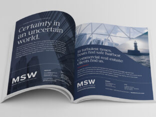
A consistent brand is a stronger brand. Discover how to align your voice, visuals, and messaging across every touchpoint.
read more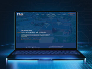
PMC Wireless partnered with Splendor to refresh their brand identity and digital presence. A new logo, refined messaging, and custom website now reflect their leadership in mission-critical communications.
read more
Your logo is more than a mark. It’s a business signal. Explore the signs it’s time for a redesign and how strategic brand identity design strengthens positioning, credibility, and growth.
read more