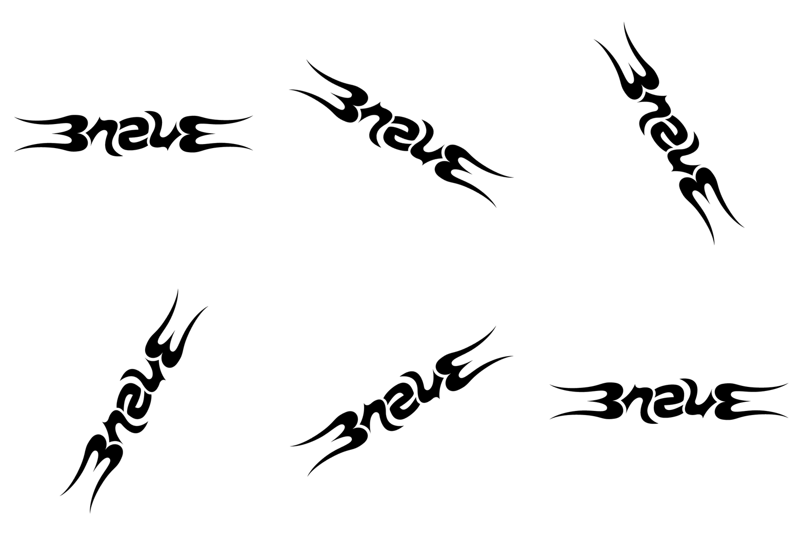
An ambigram is a piece of typography that may read the same – or completely differently – when perceived from another direction or rotation. Historically, the lettering was comprised of calligraphic letters. Modern ambigram artists, however, often handcraft their letter forms of all types, from thin and delicate to heavy and gothic.
The ambigram has been used in some interesting ways in the world of graphic design, from movie titles and book covers to music album artwork and even logo and brands. John Langdon is probably the best-known ambigram artist, though many have appeared since his emergence.
Visit John Langdon’s site to view some of his expertly crafted ambigrams – these are very cool.
Splendor created an ambigram logotype for Jersey Shore surf mecca Brave New World. This heavy logo design reads “brave” from regular position, as well as upside down. Fun logo design project for us!