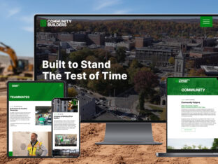
Community Builders: A Legacy Rebuilt for the Future
A veteran-led construction firm with deep community roots gets a revitalized brand system.
read morePrevious Logo:

Concept Sketches:

Final Logo:
![]()
This project was a logo redesign for The Crossing Church in Livingston, NJ. The client found their old logo difficult to reproduce in different mediums, and they wanted a more powerful and sophisticated design. The new logo had to function as a small one-color stamp, on print materials and as a large sign.
We created a clean, minimal logo with warm, inviting colors and highly legible typography. The logo symbolizes “crossing” through the C-shaped cutouts in the icon.
This logo won a 2014 GDUSA award.
A veteran-led construction firm with deep community roots gets a revitalized brand system.
read more
Splendor refreshed Erika’s visual identity and messaging to elevate a trusted name in bakery equipment.
read more
Discover how our team gave Index Engines a powerful new identity through strategy and bold design.
read more