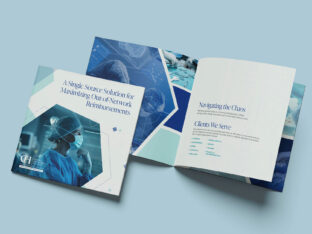
Turning Complexity Into Clarity: Building a Digital Presence for Surgeons
Splendor partnered with CHRMS to create a digital presence that simplifies complexity, builds trust, and supports growth for surgeons.
read moreImagine Mary is a first-time visitor to your site. She lands on the page and takes a minute to get used to the layout. What’s her first impression? Is the page usable, and are the key actions you want Mary to make clear?
If you want to turn site visitors into customers, your goal should be to create a user-centered landing page that draws people in and makes them want to continue forward through your sales funnel. There are dozens of ways to add usability to your site.
Your navigation should be easy to find and simple to read. About 50 percent of site visitors use the navigation bar to orient themselves to your site.
Your first step to ensuring you have a highly usable site is to put your navigation bar in a place users expect to find it. For most sites, the nav bar is across the top just under the header or in the sidebar near the top. Make it easy to find.
Instill a sense of trust and authenticity by sharing contact information in a clear and easy-to-locate place. Upon landing on a website, around 64 percent of visitors stated they look for contact info.
When site visitors see that there are several clear ways to contact you, they’re more likely to put their trust in you. Would you want to order from a site that didn’t have any methods to get in touch if something went wrong?

Mollyjogger places the link to their contact form in the top right of their page. It’s effortless to locate.
Clicking on the link takes you to a form you can fill out to get in touch. They also offer information about specific retail locations and list social media where you can keep in contact as well.
When users see a button, they expect to take some type of action with the button. If you create buttons that aren’t clickable, you risk frustrating readers. Instead, create buttons when you want the user to take a specific action.
The search bar is how many people start their adventure on your website. If you run an eCommerce site, for example, the user lands on your page and searches for a topic, such as blue sunglasses.
One study showed that sites that use a semantic-based search, which comes up with related items, have only a 2% shopping cart abandonment rate.

Foley, Inc. helps users find exactly what they’re looking for through a semantic-based search feature.
In addition to pulling up used construction equipment based on a search, they also feature some of their available inventory just under the fold.
More and more people are using mobile devices to browse websites. The number of people using smartphones worldwide will reach 2.7 billion by 2019. However, clicking on links on a smaller screen is challenging. It’s easy to click in the wrong place.
Link padding is one solution to the issue of incorrect link clicks. Add a bit of padding around links, so the clickable area increases. A larger clickable space makes your site more usable on mobile devices.
In one survey, researchers found that 73% of consumers bought a product after watching a video. Video is a powerful tool that engages site visitors and adds another element to your design. One way to engage users from the minute they land on your page is to add a video.
What type of information should you include in a video?
You can tell the story of your company, share why your process is the best in the industry or feature ways to use your products. Customer testimonial videos are another smart way to show potential customers how much others love your brand.

Rest places a video on their landing page that shows how people can use their products. The video scrolls through a few different scenarios with their wood desktop products. The images are bright and clear and take up the full screen.
When a site visitor lands on your page, is there so much clutter that they don’t know where to look?
The best designs incorporate simplicity and plenty of white space. Think about what people are looking for when they land on your page. Use heat maps if necessary to see where they are looking and clicking on your page
Remove any unnecessary elements that clutter your page but aren’t exactly what your visitor wants. If needed, create multiple landing pages to address different types of buyer personas.
A nice balance between negative and positive space allows the user to scan the page and take in the primary call to action (CTA) of the page.
Create a user-centered webpage by focusing on the elements that users most want. Once you’ve adjusted the design a bit to narrow the focus, do some split testing to see how visitors respond.
One of the best things about site usability is that you can continue to improve it from week to week. Make small adjustments, test them and make your website the absolute best it can be.

Lexie Lu is a contributing writer for Splendor Design and a freelance designer. She enjoys writing code and learning about new web platforms. She manages Design Roast and can be followed on Twitter @lexieludesigner.

Splendor partnered with CHRMS to create a digital presence that simplifies complexity, builds trust, and supports growth for surgeons.
read more
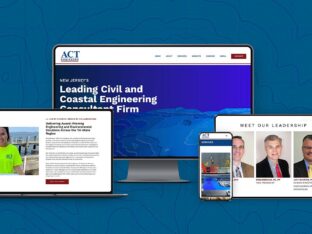
Splendor partnered with ACT Engineers to create a modern website that highlights their expertise, showcases complex projects, and delivers a fast, intuitive user experience built for a forward-thinking engineering firm.
read more
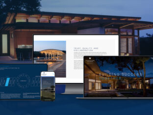
Splendor created a polished website for Signature Homes that highlights craftsmanship, elegance, and luxury in every custom residence.
read more