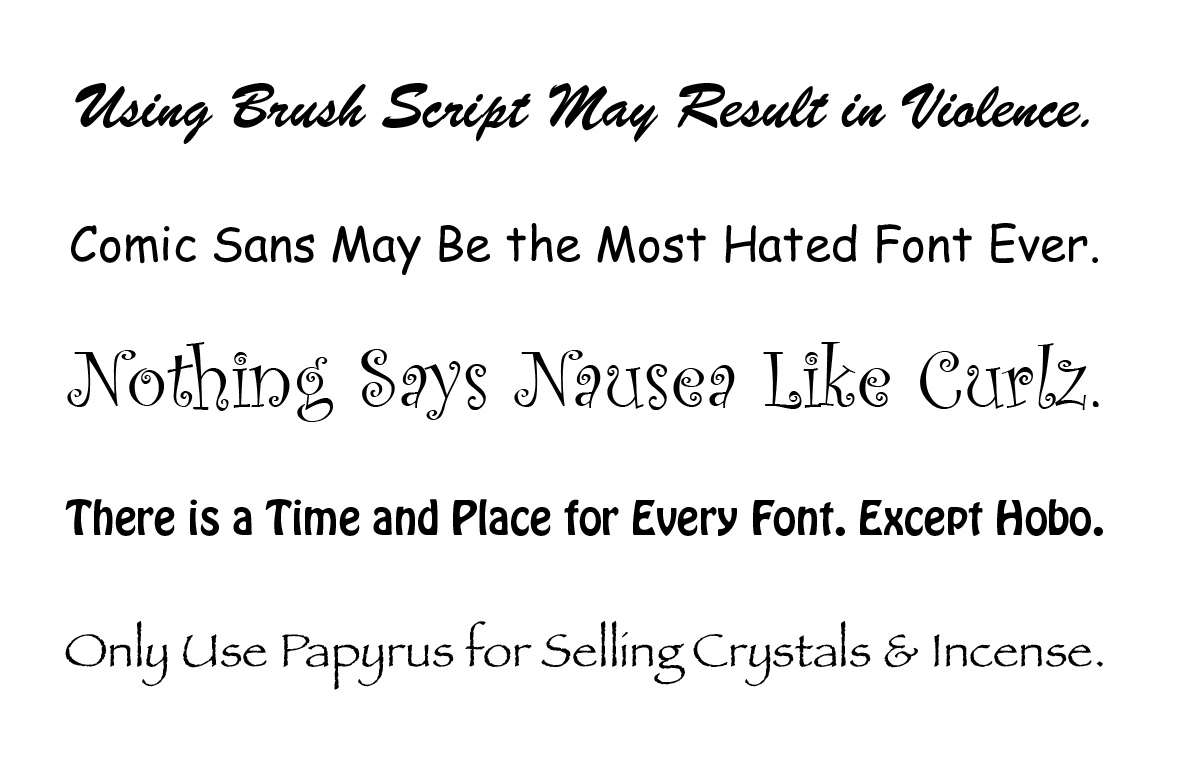
Typography is an all-important element in graphic design. From logo design to website design and everything in between, a well designed and properly executed piece of type can make all the difference in the success of the work. Designers are fanatical about their favorites, and extremely passionate about the ones they abhor.
There are a few factors that dictate when, where and how to use certain typefaces:
- When creating a title and supporting tagline, the tagline should support the title, not overpower or distract from it.
- The typeface you choose for a title should complement the meaning of the message itself – unless it is your explicit goal to achieve the opposite.
- A well designed typeface is created to perform or appear a certain way. Distorting it will most often degrade it’s effectiveness.
- Many common, popular and badly designed typefaces are overused and abused. They should be avoided in all professional design situations.
Generally speaking, any typeface that appears in your font menu when you open a software program for the first time is not the best choice. There are exceptions, but it’s best to research before beginning any website design, logo design or brochure design, to make sure the typeface you choose will do its job.
For more information and educational resources, visit Smashing Magazine.