Branding the Merger: Nine Nonprofits, One Healthcare Partnership
The Partnership for Maternal & Child Health of Northern New Jersey (PMCH) formed when nine nonprofit organizations came together to strengthen services and advocacy for mothers, infants, and families. They needed a brand agency to translate that merger into a clear, memorable identity—beginning with a logo design that could embody collaboration, care, and growth.
Our brief: create a visual identity design that honors the legacy of the original organizations while signaling a fresh, united future. The result became the spark and foundation of the PMCH brand system.
Logo Design Concept: A Tree of Nine Leaves
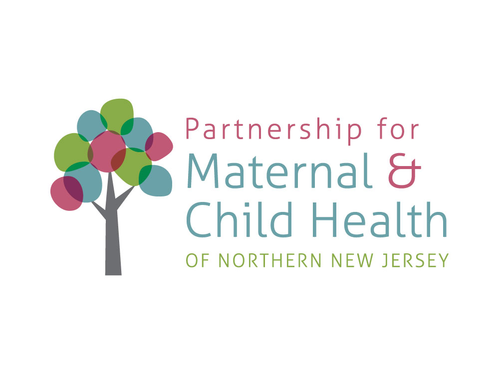
The PMCH mark centers on a tree—a symbol of life, stability, and continual growth. The canopy is formed by nine distinct leaves, each representing one of the founding organizations. Individually, every leaf stands for unique expertise and history; together, they create a protective canopy that communicates partnership, inclusion, and shared purpose.
This metaphor works on multiple branding levels: roots represent community and history; the trunk signals structure and accountability; the leaves show the partnership’s collective energy and reach. In short, the icon demonstrates how nine voices can unify into one strong, service-oriented healthcare brand.
Color Strategy for Healthcare Branding
We selected a fresh, modern color palette of greens, blues, and warm red tones. Subtle overlaps imply cooperation and resource-sharing—visual shorthand for “stronger together.”
- Greens signal health, renewal, and growth.
- Blues convey trust, stability, and care—essential traits for maternal and child health organizations.
- Red family accents add warmth, commitment, and human connection.
The palette is versatile across print and digital channels, meeting accessibility contrast targets while preserving a welcoming, optimistic tone suitable for family-facing communications.
Wordmark, Hierarchy & Brand Readability
The wordmark balances clarity with personality: clean, approachable letterforms support legibility at community-scale uses (from clinic signage to social graphics). The typographic hierarchy emphasizes “Maternal & Child Health,” while the highlighted ampersand serves as a connective device—reinforcing the partnership ethos and the continuum of care for families.
From Logo to System: Building the Visual Identity
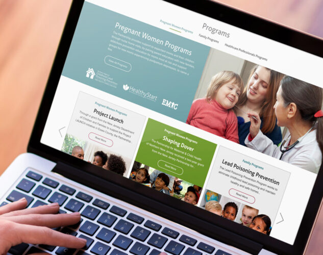
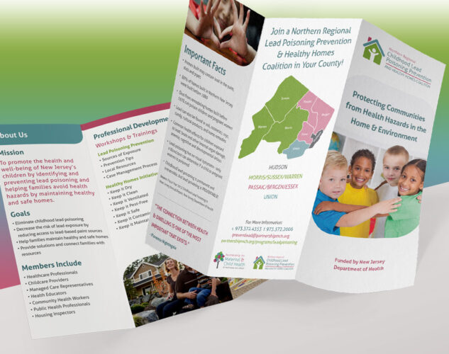
The logo became the foundation of a comprehensive brand system—a toolkit that includes color specifications, typography, graphic leaf motifs, photography guidelines, and layout rules. This system enables consistent storytelling across outreach, education, fundraising, advocacy, and partner communications.
For a multi-stakeholder nonprofit, consistency is critical. The brand system ensures every flyer, webinar slide, social post, and report speaks with one voice—clear, compassionate, and credible.
Brand Impact: Signaling a Strong, Unified Healthcare Leader
Launching with a cohesive brand identity helped PMCH introduce itself as more than a merger—it positioned the organization as a regional leader with expanded capacity, coordinated programs, and a unified mission. The identity communicates stability to partners and funders, while remaining warm and accessible for the families PMCH serves.
Key Takeaways for Nonprofit Branding & Logo Design
- Symbolism matters: A simple, memorable metaphor (the nine-leaf tree) can carry organizational history and future vision.
- Color communicates: A healthcare-appropriate palette can convey trust and warmth without sacrificing accessibility.
- System over single asset: A logo succeeds when it anchors a scalable, consistent visual identity design used across all channels.
- Brand first: For mergers and collaborations, invest in the brand early—clarity builds alignment, momentum, and recognition.

Adam Taylor, Splendor’s Founder & CEO, believes an educated client is our best client. Stay tuned to our blog for insight into the world of everything design, web, and digital media. Have something to add? Connect with us on LinkedIn – we’d love to hear from you.


