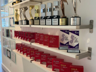
It’s a CRE bling thing.
What’s better than continuously being recognized for outstanding CRE branding and marketing? Not much, really.
read more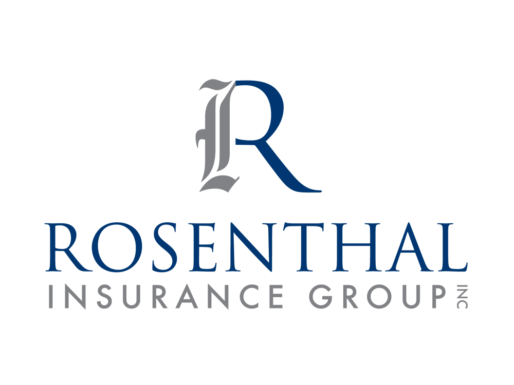
Rosenthal Insurance Group, one of the leading father and son insurance companies in NJ was seeking a logo that perfectly represents their firm with two distinct, yet complementary approaches to business.
Splendor’s design team created a clean and professional logo that marries the concepts of tradition and integrity with a progressive, contemporary approach. The primary element of this logo design is the elegant, custom letterform logo of the company name. The “R” is composed of two distinct parts, one of which is an old calligraphic letter shape, and one of which is a modern serif typeface. This logo has been used in a complete stationery system as well as website design.
What’s better than continuously being recognized for outstanding CRE branding and marketing? Not much, really.
read more
While many companies invest in advanced technology, true success comes from harnessing the power of human intelligence and creativity.
read more
With a new name and identity in hand, Starfield Companies looked to Splendor for a website design that reflects the company values.
read more