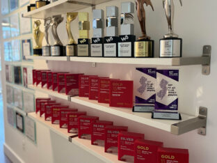
It’s a CRE bling thing.
What’s better than continuously being recognized for outstanding CRE branding and marketing? Not much, really.
read moreWhen designing or creating a brand, one of the first things founding members will do—after deciding on a name — is develop a logo. The logo is tied into the name of the business somehow, so all the brand elements complement each other.
What about the typography? This is the text or typeface that goes along with that logo, spelling out the company name, taglines, title and much more. That doesn’t matter, right? The logo, name and visual themes seem like they’d be more important – so why should typography even be considered?
In a general sense, the terms typeface, font and typography can be used interchangeably. However, even with that being the case, it’s important to understand the differences between these terms.
Back in the good old days of analog printing — with metal sheets and blocks — typeface referred to the visual style and font referred to the size and weight. Therefore, you might have the Times New Roman typeface, italicized in 28 point, which is the font. Today, with digital typeface and fonts, the terms have meshed.
Typography, on the other hand, is the entire visual spectrum involving text-based content. It encompasses the entire visual style, which includes the typeface, weight, size, white space, contrast and even how it’s presented.
When you’re choosing typography for your brand, it means considering all the disparate elements related to the visual style of text, not just the theme — such as Garamond or Arial. It’s the totality of the decision that matters most.
With that established, how does typography factor into a brand’s identity? Why is it so important and how does it affect reputation and recognition?
Typography refers to the entire visual spectrum of text, which means it has a direct influence on brand image. Messy, cluttered text that is difficult to read is going to look unprofessional and will also bog down the user experience.
That reflects poorly on the business, obviously, but it also reveals that the company itself has no clear vision, organized focus or theme. That’s bad news, especially for investors who want to see something solid, reliable and promising.
There’s no single channel where typography matters more. It is expansive and reaches everything from web copy and paper printouts to social media posts. Wherever text is used, the brand’s typography and image should be considered.
The font is the overall makeup of text and includes multiple characteristics such as the style, weight and size. You might have two completely separate fonts even within the same family. Times New Roman at 28 point in bold, for instance, is a completely different font than Times New Roman at 48 point in italics.

Check out the font used in SuperShuttle’s footer. It uses varying techniques to bring attention to segments, like the “faster” italicized descriptor for the mobile app, the bold regular text, and the color contrast between the white text and blue background.
Size is exactly what the name implies, but with digital text and content, it is denoted using point or pixel-based ratings. A 30-point font in italics would be one example. If it’s too small the material is difficult to read, and if it’s too large it can be too in-your-face. Larger text sizes are also used to call attention to a particular element, like titles or headings.
Weight refers to the additional characteristics, commonly meaning bold print but also italics, underlined or even strikethrough. Sometimes it’s necessary to consider weight when using various fonts. One might look too thin, especially on a white background, so swapping to bold print will provide a better experience.
The style refers to the visual theme or type of text — be it Times New Roman, Calibri, Arial, Verdana or something unique. This is the biggest trait when it comes to deciding brand image or relevance.
Choose a more cartoony or robotic print, and you’re giving your brand a whimsical feel. Choose something more elegant, and you’re going with a professional feel. Custom styles and typefaces are a great way to really differentiate your brand, particularly because no one else will be using it.

Aviva’s featured image utilizes a unique typeface. Notice how it also permeates to the other words on the site, including the header, hyperlinks and accent text.
Color explicitly refers to the shade of the text elements or letters. Red, blue or green text would be the example here. Another less common element is highlighting, or what color is encompassing the text. This can have a direct impact on the user experience because when poorly used, it can make text hard to read or too jarring.

Even though it’s a bit on the nose, the front page of Typography.com is a good place to peruse. You’ll notice many of the different typefaces and fonts use varying colors that mesh well with the background.
Accents include other visual animations or additions, such as a drop-shadow, stroke, outline, glow or even beveled appearance. This trait is hit or miss and really depends on a lot of the other surrounding elements.
For instance, a black drop shadow on a white background can look fantastic and add a little extra depth to the font. However, if the background is black, the shadow is obviously not going to show. Other traits like a beveled look can make text tough to read at times.
When working with text in office and document apps, you have to consider the spacing. Double-spaced lines look better sometimes. With web copy and digital content, it’s more about white space in the surrounding areas. Cram text too close together and it’s going to look cluttered and ugly. Proper use of white space in typography is necessary, even when you’re not thinking about it directly.
This trait refers to how the text is being presented or displayed. It can include the orientation such as left, center or right aligned, but it can also include similar characteristics.
Extracting a bit of text and presenting it as a blockquote is one common use. Jumbling text and displaying it across spaced areas outside of conventional methods is another example.

The way the Van Holtz’ design team displayed text on the right-hand side of its front page is a good representation of this trait. The text is not conventional, at least when it comes to alignment, and it services the overall experience.
As a whole, typography is often overlooked or forgotten about when it comes to building a brand image. That leads to the kind of shoehorned experience that that is jarring because text is used so often across many channels and promotions.
While it’s not possible to keep your typography identical across every platform — some dictate what fonts you can use — you should follow the general style as close as possible.
When choosing the initial style, consider the traits above and how they affect the final design. There are many different characteristics of a good font or typeface beyond the basics like color, weight or size. And if you need help, we’re here!

Lexie Lu is a contributing writer for Splendor Design and a freelance designer. She enjoys writing code and learning about new web platforms. She manages Design Roast and can be followed on Twitter @lexieludesigner.
What’s better than continuously being recognized for outstanding CRE branding and marketing? Not much, really.
read more
While many companies invest in advanced technology, true success comes from harnessing the power of human intelligence and creativity.
read more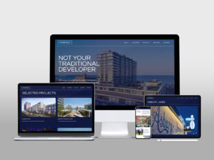
With a new name and identity in hand, Starfield Companies looked to Splendor for a website design that reflects the company values.
read more